In Part 1 of the HTML tutorial, you saw what the skeleton of an HTML page looks like and how links, lists, images and so on can be created. In order to turn it into a handsome website, the layout is still missing. We show you how to arrange elements and define colors and fonts.
Design with CSS
In order to properly design and lay out an HTML page, you need two further techniques: The HTML type DIV to define areas and the Cascading Style Sheets (CSS) to design areas and their content. First you will see how CSS works, then how DIV is used and then how layout works with DIV and CSS in conjunction..
CSS is a pretty simple way of making certain content on an HTML page global. The simplest example would be colored font : If you want a text in red font, you can simply use the HTML font tag " <font> ": " <font color="red"> ". If, however, many paragraphs should have red font and perhaps other attributes, there are two problems: On the one hand, you would have to type the whole thing at each paragraph. On the other hand, it becomes time-consuming again if all these paragraphs are to be given green letters later. So you outsource those design definitions .
With CSS you define styles for existing HTML elements or your own creations in the HEAD area of the HTML page. In the BODY area , for example on the individual paragraphs, you simply add a reference to one of your styles. A very simple example:
HEAD area:
 <style>
 p { background-color : red }
 </style>
BODY area:
 <p>
 Ein Absatz mit rotem Hintergrund.
 </p>
Here it is generally determined for the paragraph tag that the background should be red. Therefore no explicit reference has to be given in the BODY area . This is called a type selector because the definition applies to an entire HTML type. But it is more interesting when you redesign individual content :
 <style>
 .hervorhebung { color : red; }
 #seitentitel { background-color : yellow; text-align: center;}
 </style>
Two new selectors are added here: With a "." So-called " classes " begin , with "#" the IDs . IDs are intended for things that appear only once on the page, such as a navigation bar. Classes are useful for the things that happen more often, like highlighting. You can write a number of values in the definitions in the curly brackets; only a look at the CSS reference will help here. For the example, the definition " Font color = red " is sufficient for the " highlight " class and the background and text alignment are defined for the ID " page title ". The call in the BODY area then takes place as follows:
 <h1>Der Seitentitel-Bereich</h1>
 <p>Ein roter Text.</p>
So here a heading H1 is first written in red font (the other H1 specifications remain), then a paragraph with a yellow background and centrally aligned font. And if later all 20 highlighted paragraphs should not be yellow but green, you only have to change it once in the HEAD area..
If the website consists of many HTML pages, you would still have to make such changes in each document - so all the CSS code can still be outsourced yourself. Instead, it comes in its own file , named for example "stylesheet.css", which is referenced in the HEAD area of the HTML file:
<link rel="stylesheet" href="stylesheet.css">
In this case the CSS file should be in the same folder as the HTML file, otherwise the complete path should be in the href property. With this construct you can now redesign hundreds of HTML pages with thousands of elements with a single change in the central CSS definition .
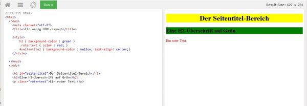 Type, class and ID selectors in action.
 Areas with DIV tags
So far, all the elements have simply been placed one below the other - of course that is not possible. So you need the HTML tag "<DIV>". With the DIV type, you can divide a page into areas , for example a navigation bar on the left, an area for the content on the right and a header bar above - a typical layout ..
A DIV tag simply means that everything in it belongs to this one DIV, starting on a new line. Without further information, all texts, tables, images or other elements would simply be shown in sequence - just as if the DIV had simply been left out. So things are pretty useless without CSS styles.
 Three DIV areas that have not been formatted any further are well positioned one below the other.
 A layout example
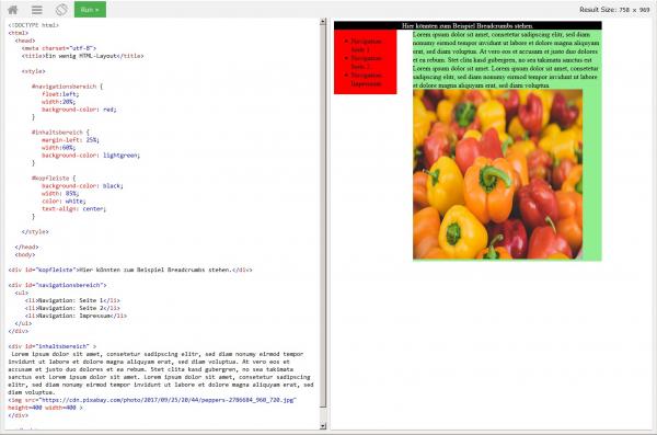
The following should be created: The navigation DIV on the left, on 20 percent of the page width, highlighted in red; the content area on the right starting at 25 percent of the page width and expanded to 85 percent, the background is light green; Header in black with white, centered writing on 85 percent of the page width.
First the definition:
 <style>

 #navigationsbereich {
 float:left;
 width:20%;
 background-color: red;
 }

 #inhaltsbereich {
 margin-left: 25%;
 width:60%;
 background-color: lightgreen;
 }

 #kopfleiste {
 background-color: black;
 width: 85%;
 color: white;
 text-align: center;
 }

 </style>
DIVs always start on a new line, so a trick is needed to display two DIVs next to each other - and it listens to the "float" attribute. Using float, an element, here the navigation DIV, is placed on the left or right and further content flows around it. And it is precisely this reflow that enables the content DIV to start on the same line.
The other attributes should be self-explanatory, only the 85 percent still need to be discussed: The content area has a margin of 25 percent of the page width to the left (margin-left) in order to leave a certain distance between navigation and content. And it extends over a further 60 percent of the screen - makes a total of 85 percent total width.
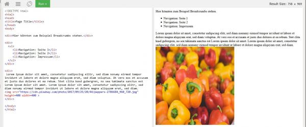
And now the actual HTML structure in the BODY area:
 <div>Hier könnten zum Beispiel Breadcrumbs stehen.</div>

 <div>
 <ul>
 <li>Navigation: Seite 1</li>
 <li>Navigation: Seite 2</li>
 <li>Navigation: Impressum</li>
 </ul>
 </div>

 <div >
 Irgendein beliebiger Text.
 </div>
Here all the elements are known again: The DIV tags are simply given IDs again and you can use the complete HTML arsenal within the tags in terms of content.
If that sounds a bit complicated: Just add the code to the w2schools.org online editor mentioned in the first part and you will immediately understand the effects. The best thing to do is to deactivate individual lines and see what happens - that is very illuminating! You can also play with the width of the page: Simply drag the border between the code area and the preview area with the mouse and you will see how the content adapts dynamically.
 Just a basic framework, but also one that you can build with!
 The whole thing is only a tiny excerpt from the possibilities of HTML and CSS. There are a number of attributes, complicated nesting of DIVs, styles and other elements as well as many other HTML components. But: Structure and call of CSS and DIV areas always follow the same pattern . So you hardly have to learn anything new, references for HTML and CSS elements are sufficient for looking up. Everything else is a question of creativity.
One last tip at the end : In practice, it is usually much easier to use a WYSIWYG editor such as Kompozer. Of course, you can also access the code there directly for fine-tuning.