The box plot or box whisker plot is a diagram that divides numerical data into so-called quartiles. This type of chart is a handy statistical analysis tool that shows the distribution of a data set. The data is divided into quartiles and the median is automatically identified. Since Excel 2016, the box function has been an integral part of Excel and can be found again as a box graphic. How to convert your data into a box plot, read in this manual.
Note: Our instructions work from Excel 2016. The online version of Excel also supports the function presented.
How to create a box plot in Excel
Follow our step-by-step instructions or read the brief instructions ..
1st step:
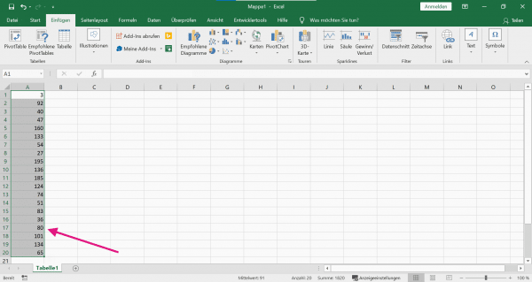 First select your data. To do this, select a single data series or several data series with the left mouse button pressed. We have created exemplary random data and select our sample data series in Excel in order to then create the box plot including the first quartile, third quartile, median and whisker. We will explain to you what exactly these parameters are.
 2nd step:
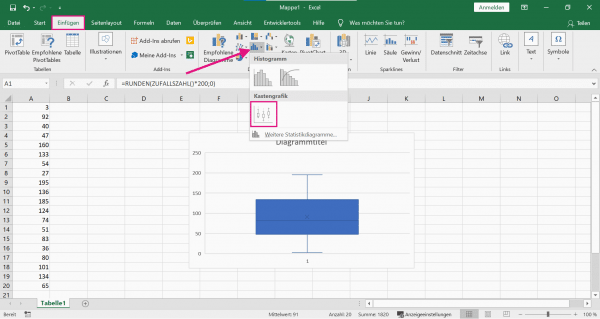 Now go to " Insert " in the menu ribbon . Then click under the group " charts " on the " histograms ". Now select the " box graphic ", which will then automatically plot your data as a box with whisker.
 3rd step:
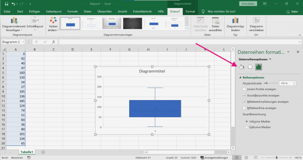 In theory, the box plot has already been created successfully. Of course, you must also be able to read and interpret the relevant parameters in the statistics. The " Format data series " function is called up by double-clicking on the diagram . Here you can adjust the data as required. The color display of the box diagram can also be changed here. In the following instructions we explain what the individual parameters mean and where they can be read in our example.
 How to interpret the box plot
In order to be able to interpret the created box, you need appropriate basic knowledge. In the following, we will explain briefly and succinctly which values the box diagram can reveal and how you can read the values in Excel.
1st step:
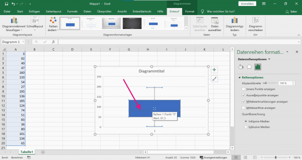
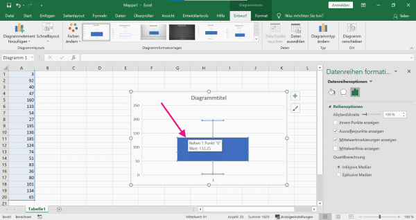 The box is the so-called interquartile range and is spanned by the first quartile and the third quartile . This area encloses the middle 50% of the data. The following applies to the quartiles: The smallest 25% of the data values are less than or equal to the first quartile. And the smallest 75% of the data values are less than or equal to the third quartile. If you want to read the values of the quartiles now, move the mouse pointer over the upper or lower line of the box and Excel will automatically show you the value.
 2nd step:
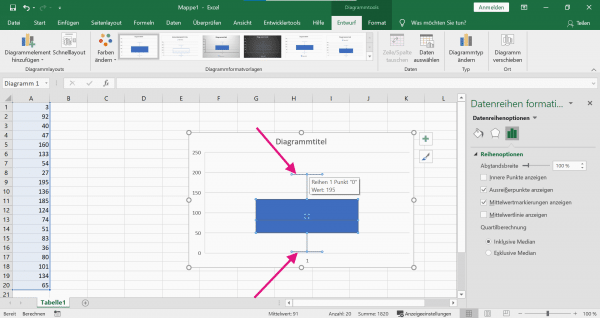
 If you want to read the median - i.e. the value in the middle of the data - move the mouse pointer over the line shown. Excel will automatically show you the median.
 3rd step:
 Furthermore, the minimum and the maximum can be read from the diagram. The values are at the end of a whisker. The whiskers - also called antennas - represent all values lying outside the box. For the maximum you have to read the upper value and for the minimum the lower value on the lower whisker.
 Brief instructions: Create a box plot
- Highlight your data series. To do this, hold down the left mouse button and select the relevant data.
- Then navigate in the menu ribbon to " Insert "> " Histograms "> " Box graphic ". Excel automatically inserts the chart next to your data.
- The box plot is ready. If you want to customize the display, double-click on the diagram and adjust the data series or the color display.