CSS grid: layout with smart function
When creating a website, a large part of the work consists of correctly arranging the different elements that compose it. The design must be attractive, but clear at the same time, and it must be understood intuitively. Cascading Style Sheets (CSS) are a tool for designing websites with these characteristics. While HTML displays content in a rudimentary way, CSS is suitable for complex layouts. The technology of the web is in constant development and now, with CSS3, new techniques have appeared that allow us to apply the language on the mobile Internet and use responsive design .
Index
- Why is CSS grid layout used?
- CSS grid: tutorial with examples
- Create containers and items
- Grid, columns and rows
- Arrangement of elements
- Assignment of areas
- Adjust alignment
- Automatic adjustments to use responsive design
Why is CSS grid layout used?
The mobile internet presents a great number of challenges for web designers: due to the enormous variety of designs of mobile devices, it is impossible to know what format is the screen on which web content will be displayed. For this reason, it is essential that the individual elements (text boxes, graphics, interactive elements) are distributed independently and at the same time clearly, keeping in mind the respective space conditions given by each screen..
Some time ago we used to work with the so-called floats , but it is a complex technique that gave rise to many errors. Today designers have two methods to implement a dynamic layout: in addition to CSS grid, you can also use Flexbox. However, the two techniques differ in some respects.
Flexbox is one-dimensional. This means that elements can only be moved along one axis. In contrast, a CSS grid layout offers the web designer two dimensions for the placement of objects because, instead of just an axis, it allows to create a grid with rows and columns ..
CSS grid: tutorial with examples
People who know how to use CSS will have no problem with grid. In the following tutorial, we will explain the most important functions for you to take your first steps with this platform.
Note
Our tutorial works with a single file: the CSS code is written in the header of the HTML file. It is also possible to create a separate stylesheet and access it from the HTML file..
Create containers and items
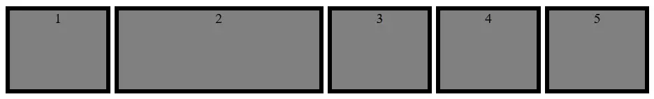
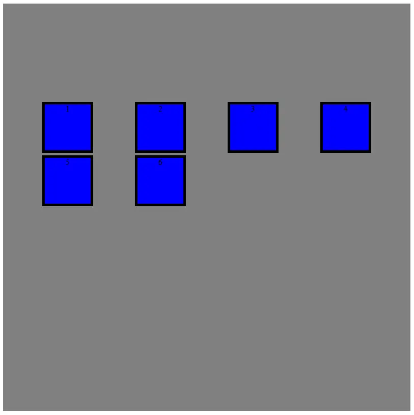
CSS grid uses two different units: containers and elements . The container is the top level and it defines the properties that will later have all the elements. From a hierarchical point of view, an item is inside a container. In addition, HTML is still needed for the design grid or grid . In the HTML part of the source code, individual elements (text, graphics, etc.) are created, which are then collected within the CSS grid and arranged in the correct position.
<!DOCTYPE html> <html> <head> <style> .grid-container { display: grid; } </style> </head> <body> <div> <div>1</div> <div>2</div> <div>3</div> <div>4</div> <div>5</div> <div>6</div> </div> </body> </html>
In this way, we have created six elements, we have defined each of them as a grid-item and we have packed them in the grid-container . To activate CSS grid, you have to start the function in the container with display: grid . The code will only generate 6 numbers, which will appear one below the other. After creating them, they can be placed relatively freely on the screen.
Grid, columns and rows
With CSS grid layout, you work with rows and columns to create a grid , in which the different elements are placed and distributed. The user is the one who decides the size of the rows and columns, adding the preferences to the container.
.grid-container { display: grid; grid-template-rows: 100px; 100px grid-template-columns: 100px; 100px; 100px; }
With these two commands we have opened a 2 by 3 grid. As you can see, the size of each row and column can be defined separately . The data is indicated successively (separated by a semicolon and a space). In addition to the exact pixel information, you can also use percentages or other units that are common in CSS. The max-content and min-content specifications allow you to create a grid based on content.
The grid-gap option creates an empty space .
.grid-container { display: grid; grid-template-rows: 100px; 100px; grid-template-columns: 100px; 100px; 100px; grid-gap: 5px; }
With this code, cells will be separated with even spaces. If you don't want even spacing, you can use grid-column-gap and grid-row-gap to customize the size of the spaces.
The fractions are a special function. This unit of measure allows dividing the screen into different sections. For example, let's imagine that we want to divide it into 7 horizontal units, with one of the columns having twice the size of the others. To do this, you can use this code:
.grid-container { display: grid; grid-template-rows: 100px 100px; grid-template-columns: 1fr 2fr 1fr 1fr 1fr; grid-gap: 5px; }
 The CSS grid layout allows you to create columns and rows of different sizes.
 The advantage of working with relative sizes instead of static specifications is that the grid can automatically adapt to the size of the screen . Although the columns have to be resized, the second column (in our example) will always be twice as large as the others. If you want to fix a row, that is, not adapt it to the size of the screen, you must assign it a static value.
Arrangement of elements
After defining the grid, the elements are placed on it. For this, you first have to create the elements and also specify the start and end values. However, not all elements necessarily have to occupy a single cell within the grid.
<!DOCTYPE html> <html> <head> <style> .grid-container { display: grid; grid-template-rows: 100px 100px 100px 100px; grid-template-columns: 100px 100px 100px 100px; grid-gap: 5px; } .grid-item1 { background: blue; text-align: center; border: black 5px solid; grid-column-start: 1; grid-column-end: 5; grid-row-start: 1; grid-row-end: 3; } .grid-item2 { background: grey; text-align: center; border: black 5px solid; } </style> </head> <body> <div> <div>1</div> <div>2</div> <div>3</div> <div>4</div> <div>5</div> <div>6</div> </div> </body> </html>
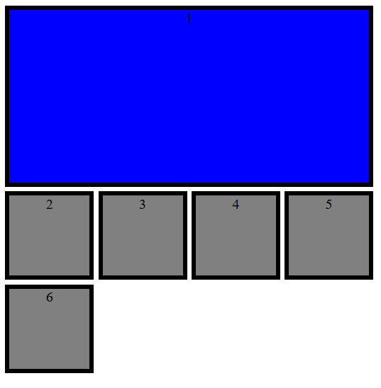 The first element occupies four rows and two columns.
 So far we have talked about two types of elements. While the last five elements only occupy one cell, the first element extends over four columns and two rows (for clarity, we have varied the design of the elements in our example, but in a CSS grid the color is not defined, the borders or indentation of texts).
The values of the beginning and the end of the elements indirectly refer to the rows and columns, because, in fact, it refers to the respective row of the grid. In the example, the fourth column ends with the fifth line. However, you have several options to specify the ranges.
- Numbering : lines are counted from left to right and top to bottom.
- Names : within grid-template-rows and grid-template-columns you can name the lines (between brackets) and then refer to these names.
- Scope : span indicates how many cells the object should comprise in a certain direction.
Instead of defining the start and end points in separate commands, web designers can combine both under one. The following code will give you the result of the previous example:
<style> .grid-container { display: grid; grid-template-rows: 100px [Line1] 100px [Line2] 100px [Line3] 100px [Line4]; grid-template-columns: 100px 100px 100px 100px; grid-gap: 5px; } .grid-item1 { background: blue; text-align: center; border: black 5px solid; grid-column: 1 / span 4; grid-row: 1 / Line2; } .grid-item2 { background: grey; text-align: center; border: black 5px solid; } </style>
Assignment of areas
CSS grid layout allows you to combine cells into areas and name them. This makes it easy to divide the elements on the grid. Settings for this are made in the container. To do this, use the command grid-template-areas and type the names of the desired areas in the cells line by line. If you don't want to assign a cell and leave it blank, you can insert a period at this location. Each row is enclosed in quotes.
.grid-container { display: grid; grid-template-rows: 100px 100px 100px; grid-template-columns: 1fr 1fr 1fr 1fr 1fr; grid-gap: 5px; grid-template-areas: "area1 area1 area1 area1 area1" "area2 area2 . area3 area3" "area2 area2 area4 area4 area4"; }
In this example, we have defined 4 different areas. A cell has been left blank. To define the elements, it is no longer necessary to specify the from-to values. It is enough to reference the corresponding area.
.grid-item1 { background: blue; text-align: center; border: black 5px solid; grid-area: area1; } .grid-item2 { background: red; text-align: center; border: black 5px solid; grid-area: area2; } .grid-item3 { background: green; text-align: center; border: black 5px solid; grid-area: area3; } .grid-item4 { background: yellow; text-align: center; border: black 5px solid; grid-area: area4; }
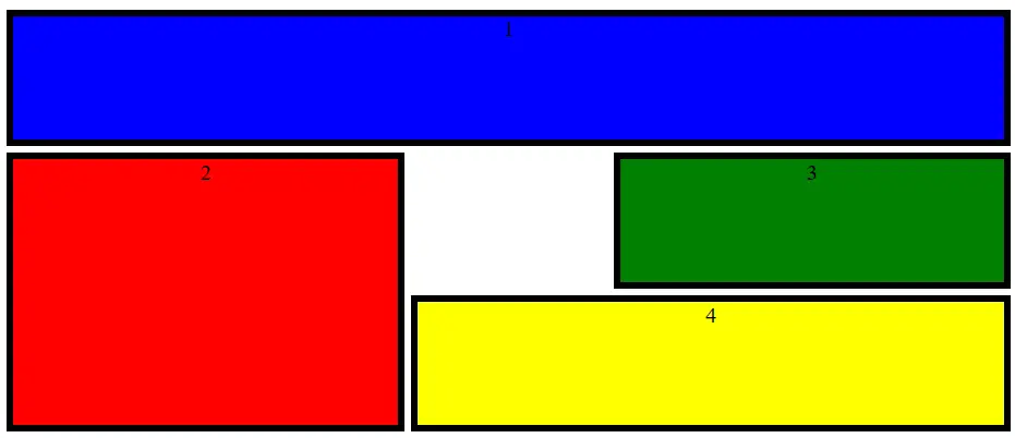 Using areas for assigning objects will make your task much easier.
 Adjust alignment
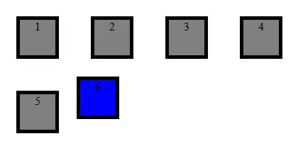
How are individual elements aligned within CSS grid? By default, elements are stretched to fit precisely on the grid. For this reason, the size of the element does not play a determining role and so far it has not been specified in the examples. Instead, we have specified which cells the object should be on. However, you can also assign a fixed size to an element and still integrate it into the grid.
Web designers can set the alignment of all elements in the container or individually align selected elements. For the first variant, use justify-items and align-items . The first command controls the horizontal alignment, the second the vertical. If you only want to align one element, use the justify-self and align-self options . All commands contain the same options.
- Stretch : the size of the object adjusts to the size of the selected cells.
- Start : the object is aligned to the left or top.
- End : the object is aligned to the right or bottom.
- Center : the object is aligned in the center.
.grid-container { display: grid; grid-template-rows: 100px 100px 100px 100px; grid-template-columns: 100px 100px 100px 100px; grid-gap: 5px; justify-items: center; align-items: center; } .grid-item1 { background: grey; text-align: center; border: black 5px solid; width: 50px; height: 50px; } .grid-item2 { background: blue; text-align: center; border: black 5px solid; width: 50px; height: 50px; justify-self: start; align-self: start; }
 CSS grid allows you to change the alignment globally or individually.
 You can also abbreviate the instructions using place-items or place-self . Both vertical and horizontal information can be indicated in a single line: place-items : <align-items> / justify-items> .
place-items: center / end;
It is then possible to arrange the elements on the grid. However, you can also move the entire rack inside the container. If you are working with a CSS grid template with static size specifications, the grid may not be the same size as the entire container. In this case you can use justify-content and align-content to align the grid within the container, and thus also within the screen. For this there are also several alignment possibilities:
- Start : Left aligned or Up aligned
- End : right-aligned or bottom-aligned
- Center : aligned to the center
- Stretch : stretch by grid
- Space-around : uniform distribution of space around cells
- Space-between : uniform distribution of space between cells
- Space-evenly : uniform distribution of space around cells, including the border
.grid-container { display: grid; width: 800px; height: 800px; background: yellow; grid-template-rows: 100px 100px 100px 100px; grid-template-columns: 100px 100px 100px 100px; grid-gap: 5px; justify-content: space-evenly; align-content: center; }
 You can align not only individual elements, but even the entire grid within the container.
 For this there is also an abbreviation: place-content: <align-content> / <justify-content> .
place-content: center / space-evenly;
Automatic adjustments to use responsive design
One of the main advantages of CSS grid is the flexibility of the grid. CSS grid can be configured to wrap automatically. This not only makes it easier to display on different devices: automation will also make it easier for you to work with CSS.
A useful function is repeat () . Instead of defining each row or column individually, you can also specify a size and how often this scheme should be repeated . This is even easier in combination with the auto-fill and auto-fit options . In this way, the creation of rows and columns is delegated to CSS grid. With the first option, you insert as many cells as possible without exceeding the container limits. However, this can leave unused space. The auto-fit option , on the other hand, adjusts the size of the cells so that they use all the available space.
.grid-container { display: grid; width: 800px; height: 800px; grid-template-rows: repeat(auto-fit, 100px); grid-template-columns: repeat(auto-fit, 100px); grid-gap: 5px; }
The two functions grid-auto-columns and grid-auto-rows are also very useful. These two instructions give you more freedom when creating elements . If, for example, you have a grid with the dimensions of 4x4 cells and now an element is created that must start from the fifth column, it would be a problem. With the automatic row and column creation feature, this mishap is avoided.
.grid-container { display: grid; grid-auto-rows: 100px; grid-auto-columns: 100px; grid-gap: 5px; }
Even if the size of the grid and elements must be adapted to the screen, web designers like to enter minimum and maximum values. The minmax () declaration is used to ensure that no element gets too small or too big. Indicate the smallest value in parentheses first, then the largest.
.grid-container { display: grid; grid-template-rows: 100px 100px 100px; grid-auto-columns: minmax(50px, 150px); grid-gap: 5px; }
By combining several of the presented functions, you can easily create a responsive design .
<!DOCTYPE html> <html> <head> <style> .grid-container { display: grid; grid-template-columns: repeat(auto-fit, minmax(100px, 1fr)); grid-gap: 5px; justify-items: center; align-items: center; } .grid-item1 { background: grey; text-align: center; border: black 5px solid; width: 100px; height: 100px; } </style> </head> <body> <div> <div>1</div> <div>2</div> <div>3</div> <div>4</div> <div>5</div> <div>6</div> <div>7</div> <div>8</div> <div>9</div> <div>10</div> </div> </body> </html>
In summary
CSS grid layout allows designers to create demanding layouts with little effort. With the grid, you can always control where items appear, even in a responsive layout.