When you create a chart in Microsoft Excel, a title or legend may appear for it automatically. In most cases, however, these generated labels are not suitable for describing your diagram in the way you want. This is why Excel offers the option of choosing your own axis labels and adapting them as you wish.
How to insert axis labels in Excel
Follow our step-by-step instructions or take a look at the brief instructions .
1st step:
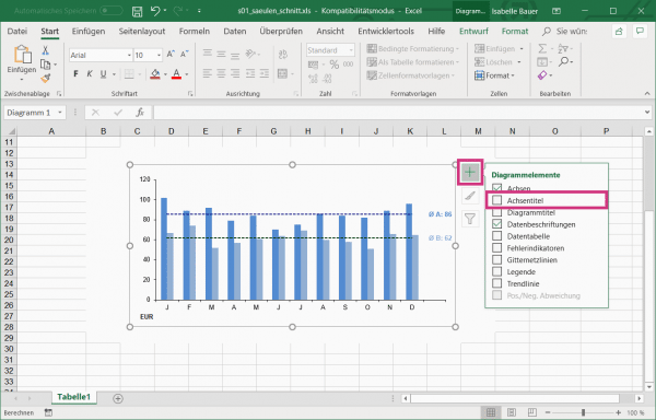 Open Excel and select your chart that you want to add the axis labels to. Then click the top right of the chart on the green plus UMD put a hook in the option " axis titles ."
 2nd step:
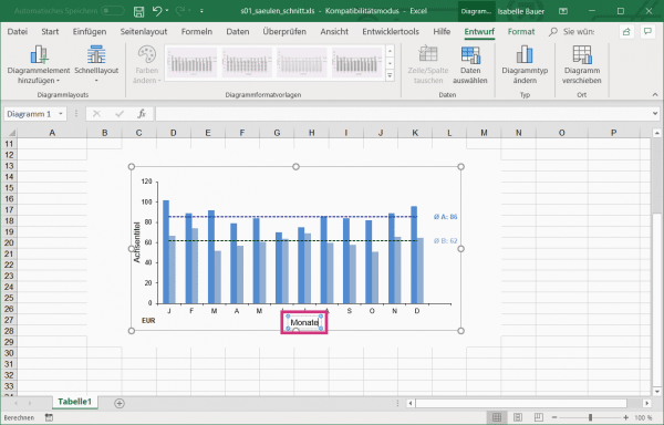 To edit the axis labeling, double-click the text field and then enter your desired text.
 3rd step:
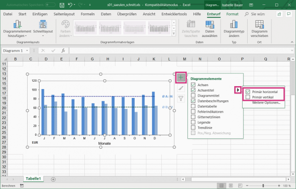 In order to choose whether the axis label should be displayed vertically or horizontally , click again on the green plus . Then go to the black arrow behind " Axis title ". Now uncheck " Primary vertical " or " Primary horizontal " - depending on where the label should be.
 quick start Guide
- Open Excel and select your chart. Click on the green plus at the top right and check the box next to " Axis title ".
- To edit the title, double-click in the text field and enter the desired text.
- If you only want the axis title vertical or horizontal , click again on the green plus and then on the black arrow behind " Axis title ". Then check " Primarily vertical " or " Primarily horizontal " - depending on where you want the title to appear.